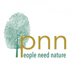
Starting a charity means creating all sorts of new things, and one of the things we were most keen to create was a logo. A logo helps a new organisation think about who they are, what they are trying to do and what sort of response they want to generate from those who might be interested in them. Having very little money to start with, we decided to see if we could find an alternative way to create a new logo, other than commission something from a very expensive graphic design consultancy.
Our CEO Miles King had been in contact with Jane King (no relation) of Pale Blue Dot, about working together on a project about farming and nature. Pale Blue Dot is an arts-science collaboration based in Oxford, whose aim is “raising public awareness about a range of environmental and social concerns through exhibitions, workshops, publications and events.”
In conversation, Miles mentioned that PNN were looking for someone to design them a logo, and Jane mentioned Pale Blue Dot have been collaborating with art and design students at Banbury and Bicester College and Oxford Brookes on projects that promote the benefits of interdisciplinary learning.
The idea emerged of a competition for students to design a logo for People Need Nature – with a £100 prize for the winning entry. After some discussion about what sort of messages the logo should convey, Jane drew up a brief and the students went away and worked up some ideas. Several students entered the competition and when one of them, Ali Reed, sent across some of her designs, there was an immediate, strong and positive response from the PNN trustees. Here are some of their comments:

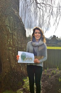
Ali Reed with here winning design for the People Need Nature logo
“Fingerprint is my favourite; infinitely better than anything I could have come up with in a month of Sundays!!! Damn I hate people with talent!
“I agree. The fingerprint is very original, and fits well with our mission.”
“I really think the finger print is good ~ so many parallels ~ Mans imprint on Nature ~ The link between Humanity and the Natural World ~ Human Life and Nature the inseparable link.
Says out loud People Need Nature. It is very good on many levels, will be difficult to beat..”
All could see strong potential in one particular design and Ali was asked to develop it further. Over a period of several months the initial ideas developed into the final form which we have now chosen. We think it’s clean and simple and conveys exactly what we are about, the relationship between people and nature and our dependence on nature for things like joy, inspiration and spiritual sustenance.

We’re thrilled that our logo will first appear on the Floodplain Meadows Parnership Handbook, a project which our CEO Miles King has been involved with, over the last 10 years or so.
Jane King from Pale Blue Dot was delighted that he students were able to make such a significant contribution to the development of People Need Nature.
The winning student Ali Reed was delighted to receive her prize. Ali said “I’ve loved being involved with this, particularly as nature always inspires my own work.
It was so great to see my logo up there with The National Trust, Natural England and the RSPB logos! How exciting!”
Thanks to Jane, Ali and all the students who entered the competition.

Great logo – well done Ali / Jane / miles! Good luck……
Thanks very much Tom and thanks for your message. I’m heading up to London on the train at the moment. I will phone you back next week.